A Student-Friendly Website Navigation Redesign
Problem: The current Rider University Math Department website was challenging for students to navigate to find important information.
Goals: Clear sidebar menu navigation
Solution: Change the sidebar menu categories to reflect user and stakeholder goals, as well as actual content contained in pages
Constraints:
Need to conform to university-wide website formatting and naming conventions
Marketing copy requirements from higher level stakeholders
Step 1: Establishing Context and Background Research
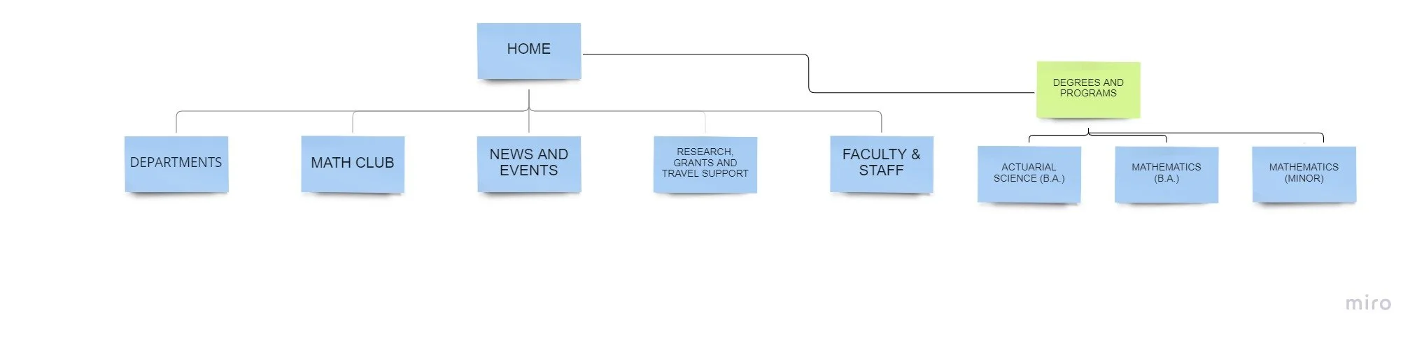
Sitemap: Initial (Desktop)
The initial sitemap based upon the side navigation menu revealed some immediate issues with page names. The ordering needed to be optimized in favor of user needs and some page names needed to be changed based on actual page content. Some elements, such as the Departments button and the unclickable ‘Degrees and Programs’ title needed to remain to be consistent with university-wide website practices.
Desktop View of Sidebar Navigation Menu


Mobile View of Sidebar Navigation (Initial)
A look at the mobile view revealed that the ‘Programs and Degrees’ section was not visible as part of the sidebar menu, but had been moved to the bottom of the site (requiring several scrolls down to reach it). Therefore, if students were viewing the site through mobile, they may not see the ‘Programs and Degrees’ section if they did not scroll down.
Step 2: User Research and Synthesis
Stakeholder Interviews
I interviewed the department chair about his goals for the website. His goals included ease of use, logical menu labeling and formatting, elimination of outdated content and addition of some other information. The chair also solicited feedback from faculty members, based on questions I supplied.

User Survey
I conducted a user survey of 7 questions to understand more about how students and faculty are using the website. I asked about difficulties, frequency of use, favorite pages and suggestions for improvement.
8 students and 1 faculty responded, giving important insights into the user experience.
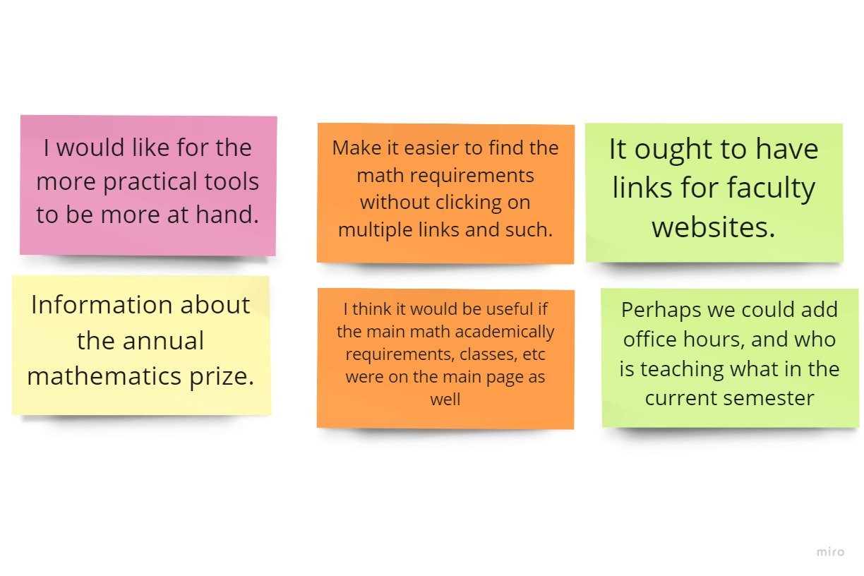
User Survey Insights
User comments focused around some main topics:
easily accessible faculty information (personal site links, office hours, current courses taught)
easily accessible program requirements
User Personas
The following fictitious personas helped me to keep different types of users in mind for the redesigns. These were created after interviewing the department chair about the types of students using the site.

Max Wagner, 20, Junior, Math Major
Website Goals: find program requirements, professor contact information
Device: laptop
Max loves math and plans to attend graduate school. Max has ADHD and sometimes has difficulty focusing on a task. He can get distracted by too much information. Being able to check program requirements periodically helps him keep on track with his studies.

Julia Irving, 19, Sophomore, Math Education Major
Website Goals: finding out about Math Club, learning about student resources
Devices: laptop, iphone
Julia is focused on becoming a teacher and passing her math requirements to complete her program. She is finding some of the upper level math classes challenging and could use extra help.

Inez Vasalda, 18, Freshman, Actuarial Science Major
Website goals: find faculty contact information and student resources (such as tutoring).
Device: Android phone
Inez is a first-generation student in a challenging major. She is not very familiar with the culture of higher education. Inez needs extra guidance and help in moving forward with her studies.
Step 3: Ideation
Proposed New Sitemap
Working with the math chair, we changed the menu page titles to reflect the actual content on pages and delete unused sections, while combining others. The ‘Faculty & Staff’ page can house all the faculty information requested by users, such as personal site links, office hours and current courses taught.


Wireframing New Version (Desktop)
A low fidelity wireframe of the desktop view shows the new navigation menu page titles.

Wireframe of New Mobile Version
This design solves the hard to locate ‘Degrees & Programs’ section by adding a menu button for this item directly under the first side menu. Ideally, the ‘Degrees & Programs’ heading would match the typography of the ‘Departments’ heading, which is bolded, colored, larger font size and offset from the other menu page titles’ alignment to highlight this important section. In order to save space on the mobile version the ‘Mathematics (B.A.)’ and Mathematics (Minor) page headings shown on digital would have to migrate to an intermediary page, which would need to be created.

Version 2, Digital Wireframe of Mobile View: Solving the Case of the Missing Section
This version solves the issue of ‘Degrees & Programs’ without requiring an intermediary page to navigate to the individual degrees and programs by simply adding another accordion menu with the degree and program pages visible upon expansion of the menu.
Another change is the naming of the ‘Departments’ page to ‘All Departments Home’, which better reflects the navigation function of the page title. This should alleviate confusion as to what ‘Departments’ was referring to.
A third change was an addition of a ‘Careers in Math’ page requested by the department chair, after I showed him the comparison of some other university math department website menus and content.
Next Steps
The menu bar changes are to be sent to the university developers for approval and implementation. Once implemented, user testing can be conducted on the actual website, as it is not difficult to make changes. With the results of user testing and more stakeholder input, refinements can be made on the final iteration.